No. 16 · Product & SaaS · Rate it
Clay
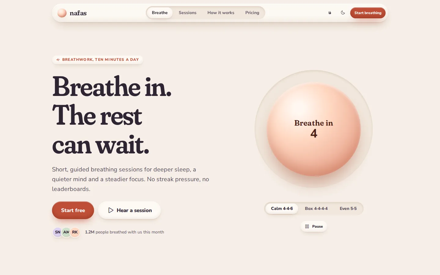
Soft, tactile wellness — puffy clay surfaces, pastel tiles, controls pressed into the page
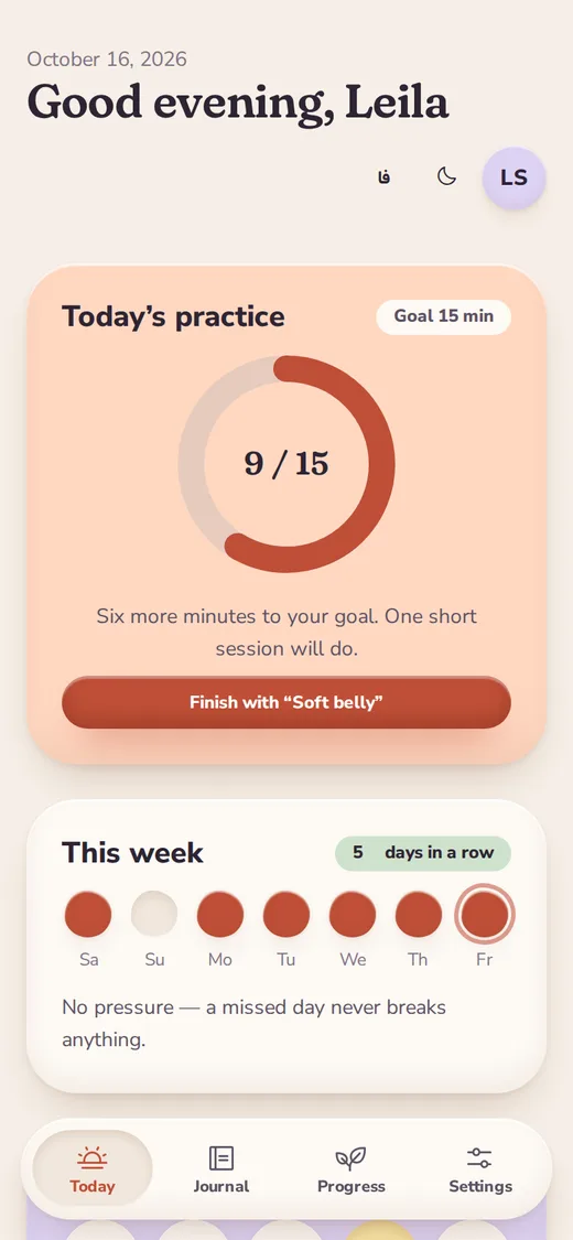
A gentle, physical language for wellness and personal products. Surfaces look like soft clay lit from above — an inner highlight, an inner shade and a warm cast shadow — on a cream ground with pastel tiles (peach, sage, lavender, butter, sky, rose) and one terracotta brand. Inputs, tracks and tab bars are wells pressed into the surface; the chosen option pops out of them. Pills, blobs and pebbles replace boxes; Fraunces with its soft axis gives a rounded serif voice (Vazirmatn for Persian). Motion is slow and springy, led by a breathing orb. The app side becomes a floating dock on phones.






Best for
- Wellness, meditation, sleep and health apps
- Habit, journaling and personal-growth tools
- Kids, family and education products
- Friendly onboarding and multi-step sign-ups
Not ideal for
- Dense data tables and admin consoles
- Finance, legal and enterprise compliance
- Brands that need sharp, technical credibility
Signature moves
- Clay shadows: inner highlight + inner shade + warm cast shadow
- Wells pressed into the surface; the chosen tab or chip pops out
- Pastel tiles for moods and categories, one terracotta brand
- Pills, blobs and pebbles instead of boxes and borders
- Fraunces SOFT serif with Nunito Sans; Vazirmatn for Persian
- Breathing orb, choice-card wizard, floating dock on phones
Try it with another brand color
Opens the demo with only --brand changed. The style should still read as Clay.
Install this skill
/plugin marketplace add tastefolio/tastefolio.github.io
/plugin install clay@tastefolio
npx skills add tastefolio/tastefolio.github.io --skill claycurl -L https://tastefolio.github.io/downloads/clay.zip -o clay.zip
unzip clay.zip -d .claude/skills/Copy the folder anywhere your agent can read it, then reference it from AGENTS.md / rules:
"Follow skills/clay/SKILL.md for every UI change."Files
Rate this style
Like it? Give it a 👍 below; you sign in with GitHub. The gallery’s Top rated order counts these votes and refreshes every hour. Comments and questions are welcome too.