No. 03 · Brand & lifestyle · Rate it
Atelier
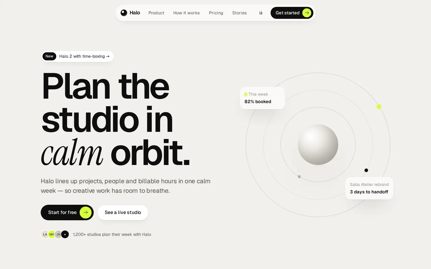
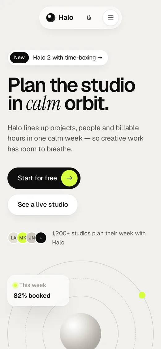
Gallery-grade product marketing — huge tight type, serif-italic accents, glass and motion
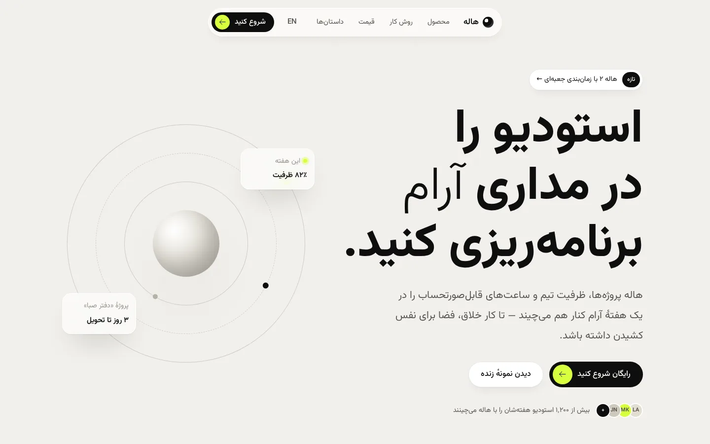
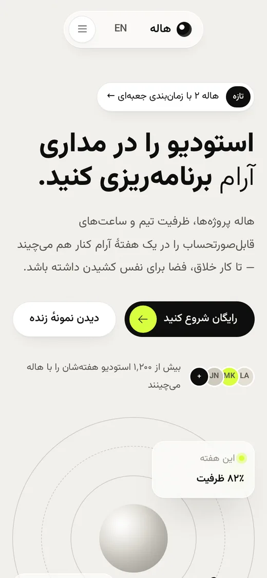
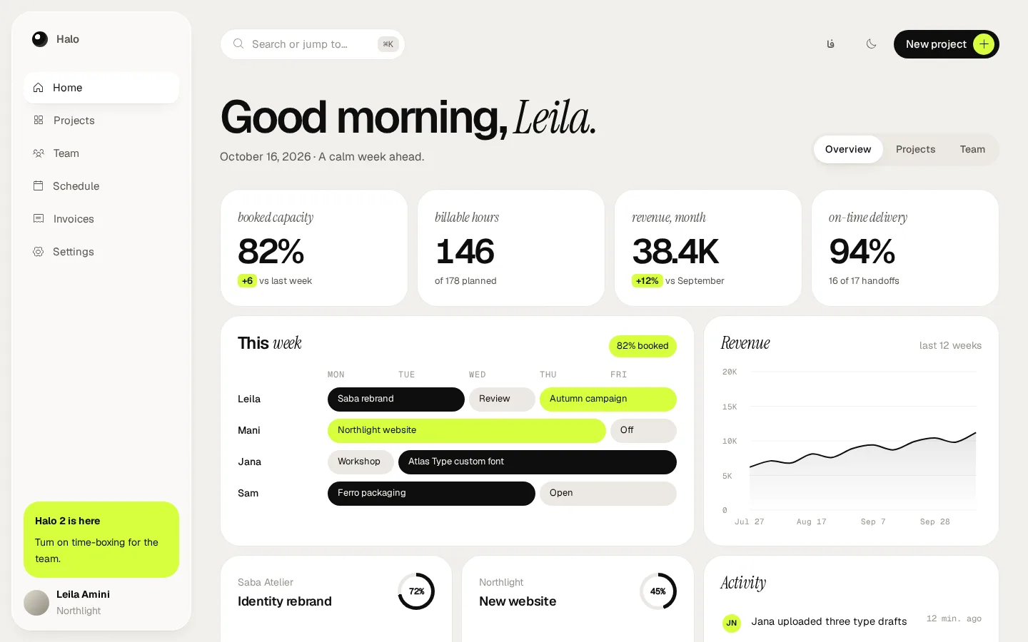
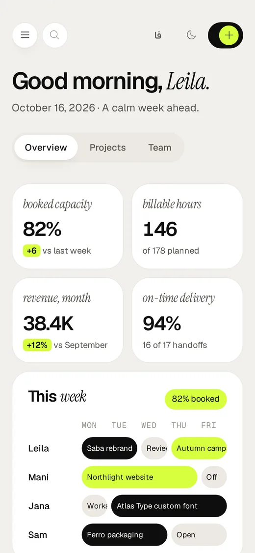
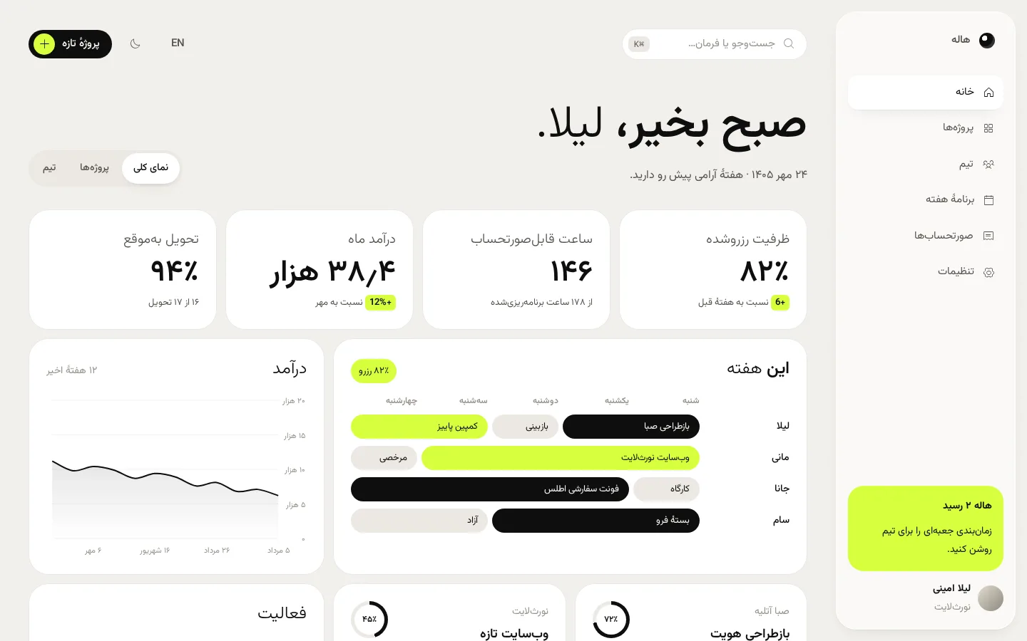
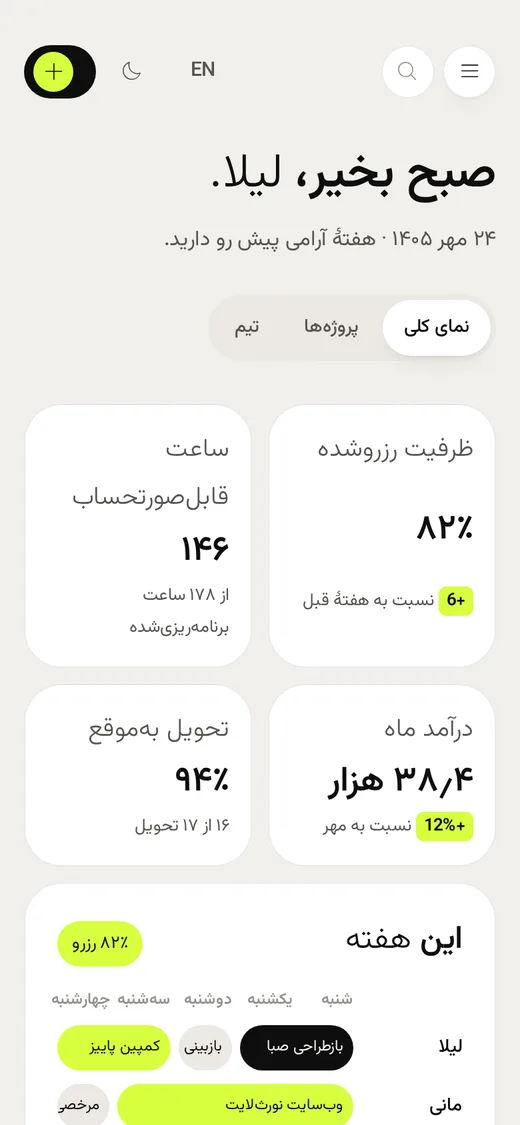
A monochrome, expensive-feeling language for products that need to look considered: warm grain canvas, enormous tightly tracked headlines with one serif-italic word, pill buttons with a highlighter dot, bento tiles, choreographed reveal motion and a highlighter-lime accent that only ever sits behind black text. The app side is an airy studio with a floating glass dock, greeting headline and a command palette.
Best for
- Launch and landing pages that must feel premium
- Creative tools, studios and agencies
- AI and productivity products avoiding the template look
- Calm, low-density personal or team dashboards
Not ideal for
- Data-dense admin or finance tools
- Catalogs with hundreds of products
- Audiences that need maximum speed on low-end devices
Signature moves
- Display type 90–124px, weight 600, tracking −0.055em, one word in serif italic
- Black pill CTA ending in a lime dot with an arrow that rotates on hover
- Bento grid of white, ink and lime tiles at 28px radius
- Reveal choreography: fade, 28px rise and blur-to-sharp, staggered
- Floating glass pill navigation; giant wordmark in the footer
- Studio dashboard with glass dock, greeting headline and ⌘K palette
Try it with another brand color
Opens the demo with only --brand changed. The style should still read as Atelier.
Install this skill
/plugin marketplace add tastefolio/tastefolio.github.io
/plugin install atelier@tastefolio
npx skills add tastefolio/tastefolio.github.io --skill ateliercurl -L https://tastefolio.github.io/downloads/atelier.zip -o atelier.zip
unzip atelier.zip -d .claude/skills/Copy the folder anywhere your agent can read it, then reference it from AGENTS.md / rules:
"Follow skills/atelier/SKILL.md for every UI change."Files
Rate this style
Like it? Give it a 👍 below; you sign in with GitHub. The gallery’s Top rated order counts these votes and refreshes every hour. Comments and questions are welcome too.