No. 02 · Product & SaaS · Rate it
Hearth
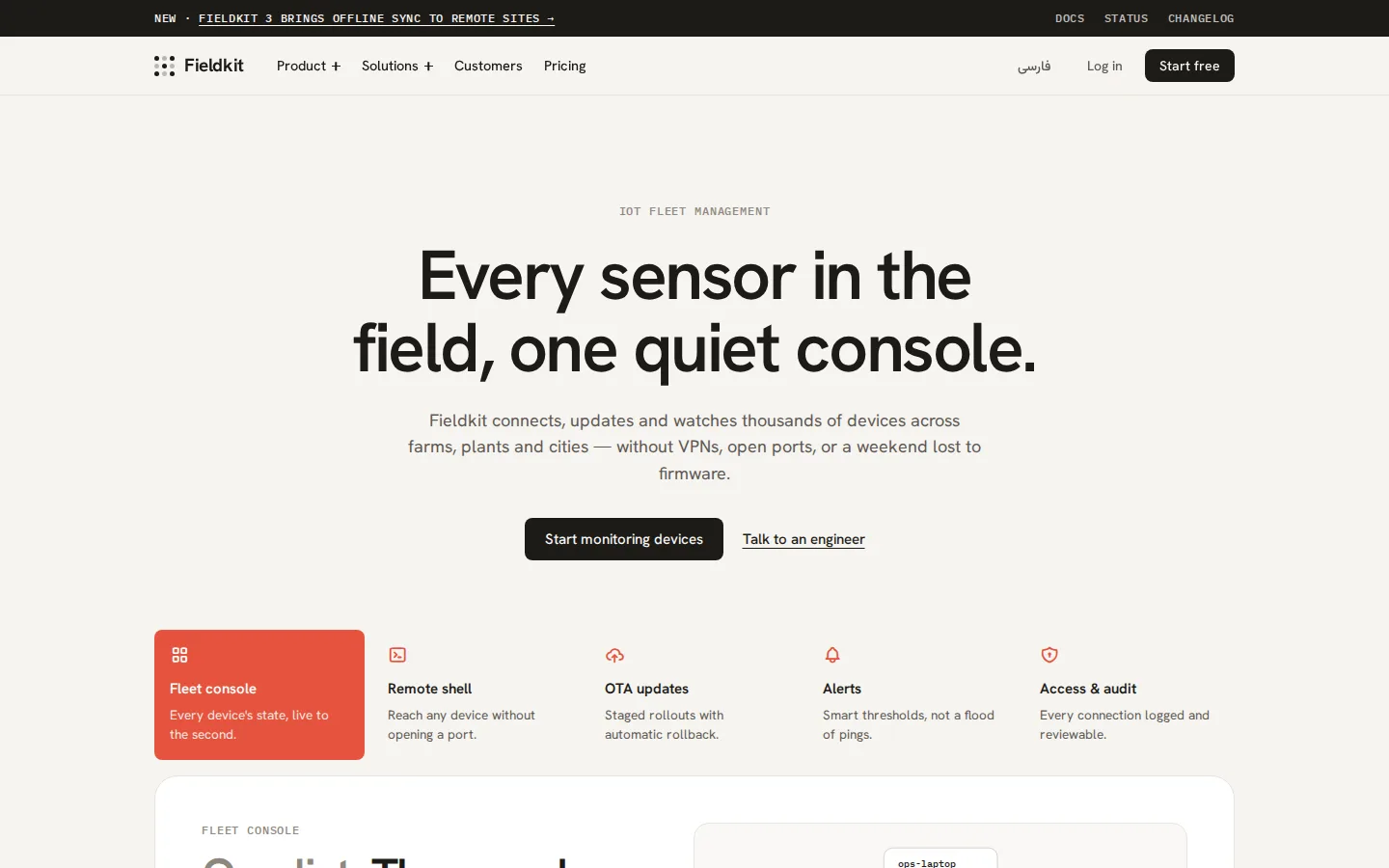
Warm technical clarity — paper canvas, ink buttons, mono labels, honest tables
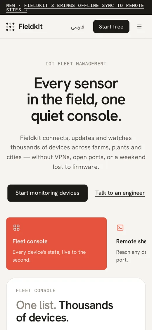
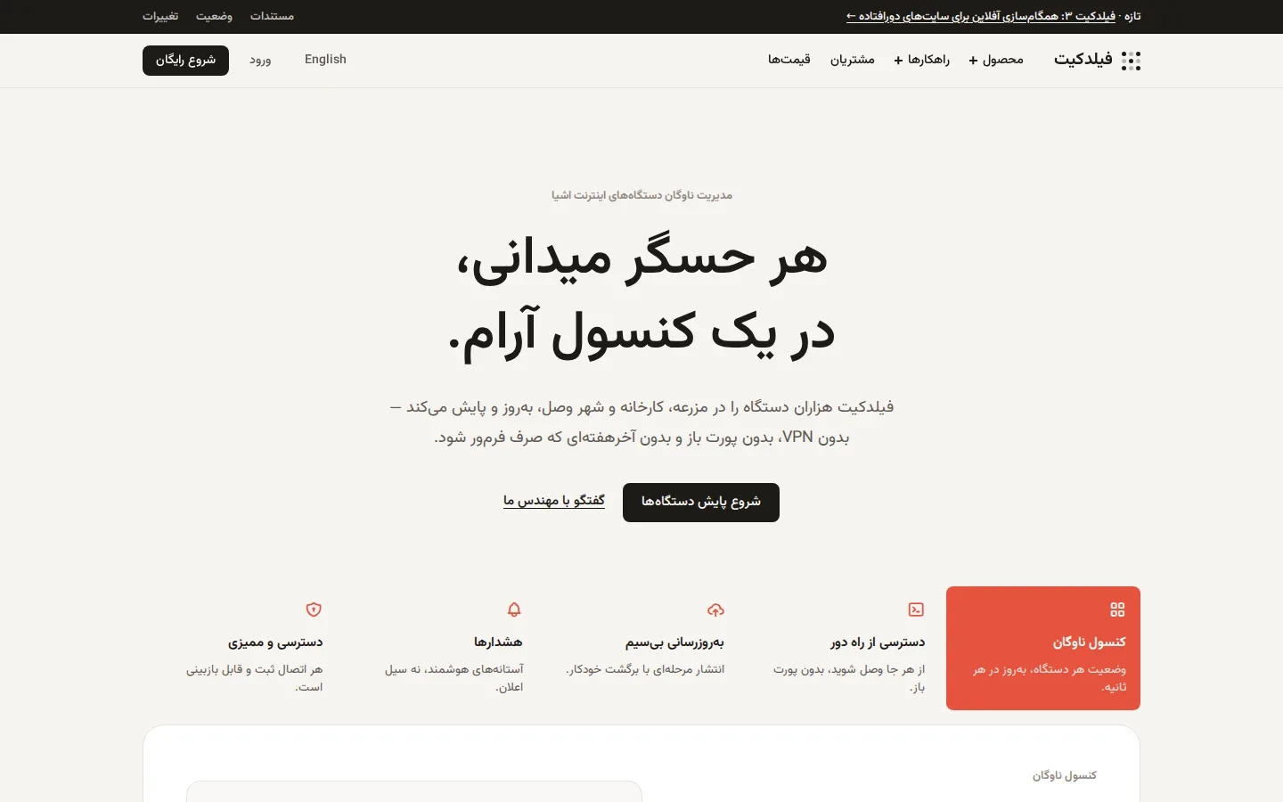
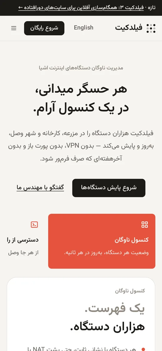
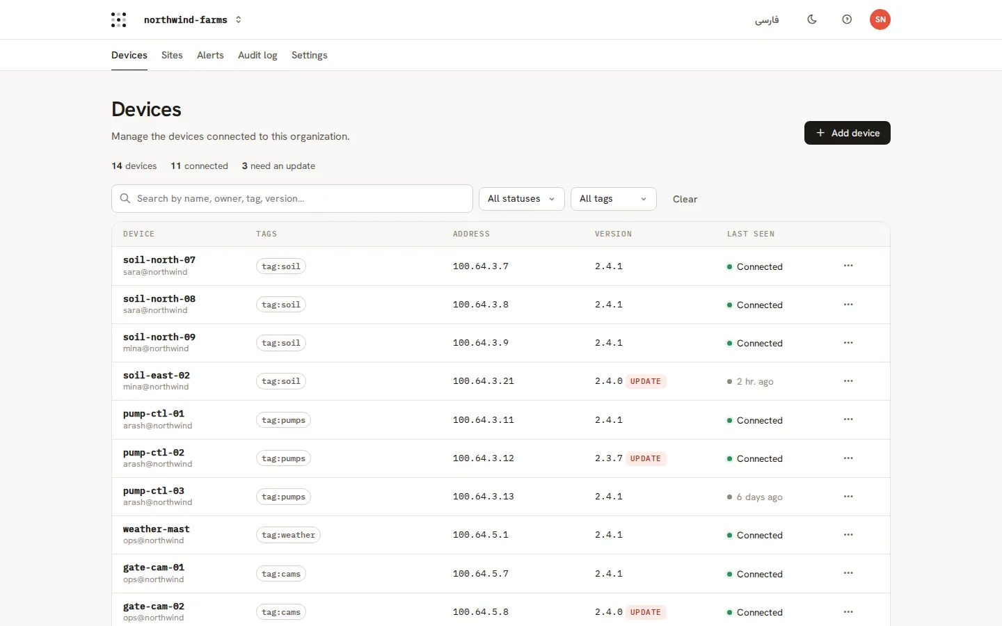
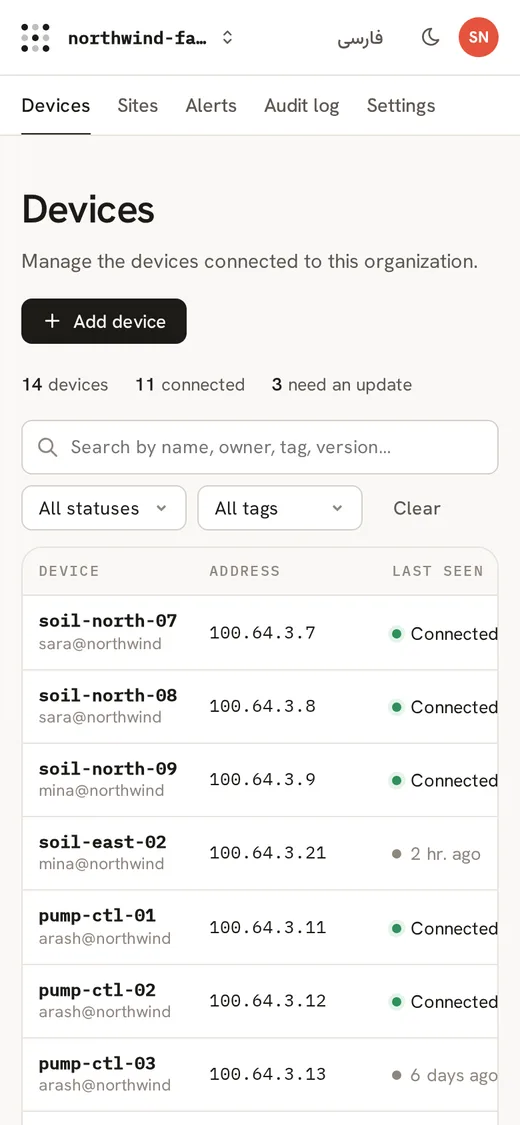
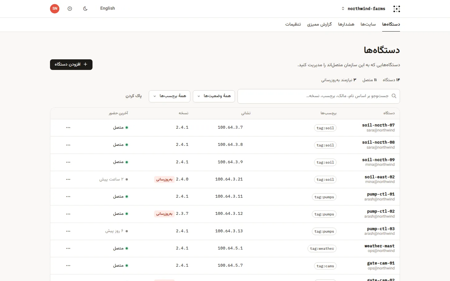
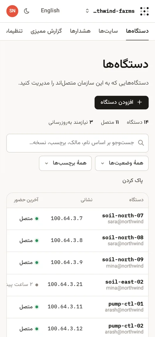
A friendly infrastructure voice: warm off-white canvas, near-black type and buttons, uppercase monospace labels, two-tone headlines and one warm accent that only fills the active feature card. The console is a dense, sortable device table with status dots, copyable addresses, row menus and a detail drawer.
Best for
- Networking, IoT and infrastructure products
- Developer platforms that want to feel human
- Admin consoles built around one big table
- Technical marketing sites with product diagrams
Not ideal for
- Fashion, food or lifestyle brands
- Kids' and playful consumer apps
- Dark, neon or gaming aesthetics
Signature moves
- Black announcement bar with uppercase monospace text
- Two-tone headings: first clause gray, second clause ink
- Feature tab row where only the active card fills with the accent
- Primary buttons are ink, never the accent color
- Dense device table: bold mono name + owner, tag pills, copyable mono address, status dot
- Row ⋯ menus and a side drawer instead of new pages
Try it with another brand color
Opens the demo with only --brand changed. The style should still read as Hearth.
Install this skill
/plugin marketplace add tastefolio/tastefolio.github.io
/plugin install hearth@tastefolio
npx skills add tastefolio/tastefolio.github.io --skill hearthcurl -L https://tastefolio.github.io/downloads/hearth.zip -o hearth.zip
unzip hearth.zip -d .claude/skills/Copy the folder anywhere your agent can read it, then reference it from AGENTS.md / rules:
"Follow skills/hearth/SKILL.md for every UI change."Files
Rate this style
Like it? Give it a 👍 below; you sign in with GitHub. The gallery’s Top rated order counts these votes and refreshes every hour. Comments and questions are welcome too.