No. 01 · Product & SaaS · Rate it
Switchboard
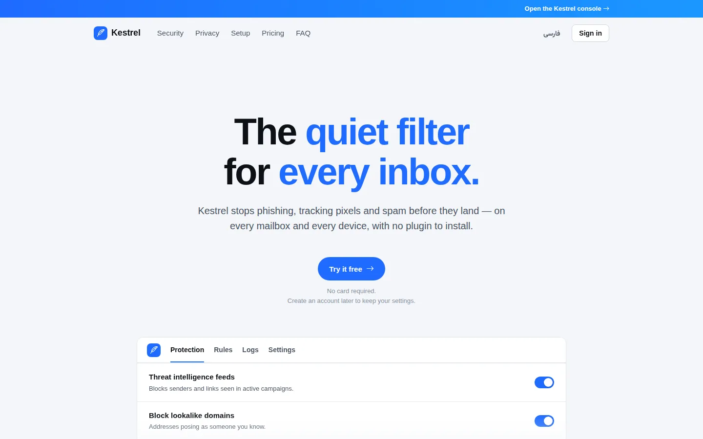
Calm, settings-first utility UI where every option is one clear switch
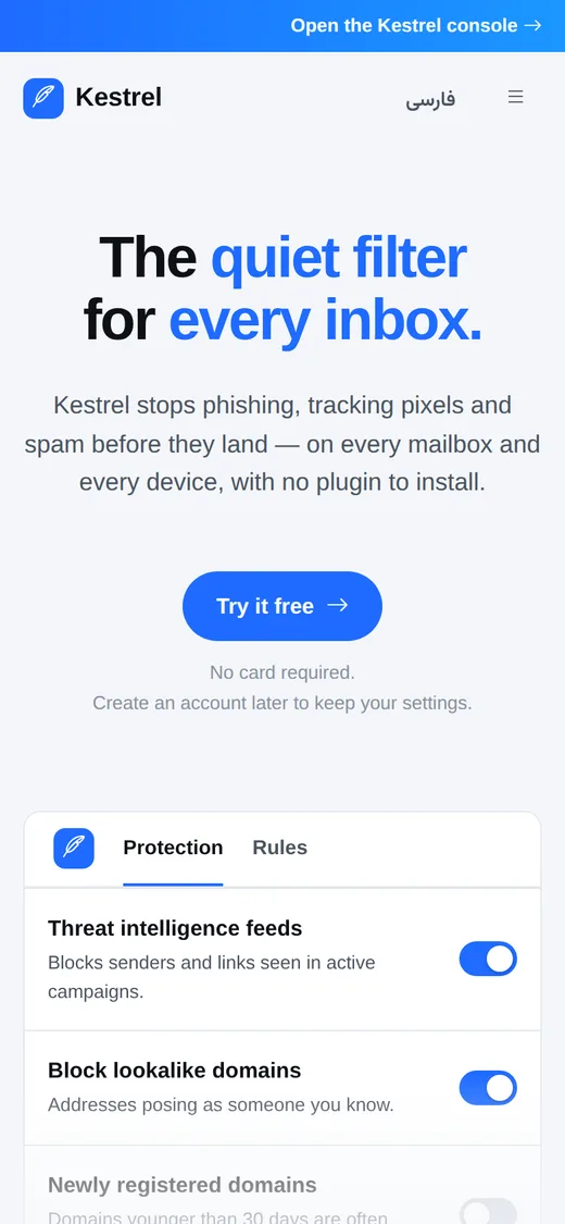
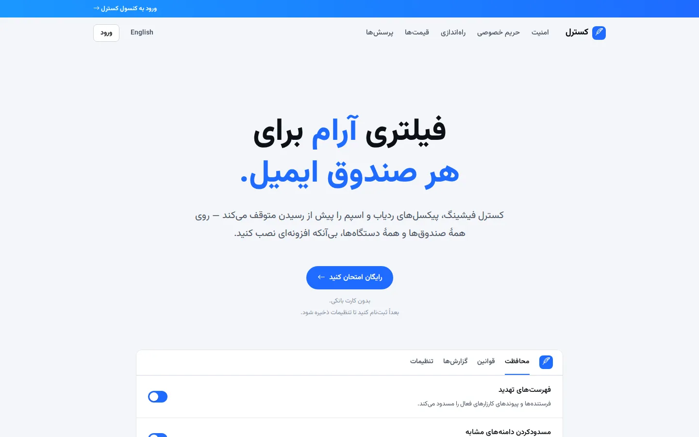
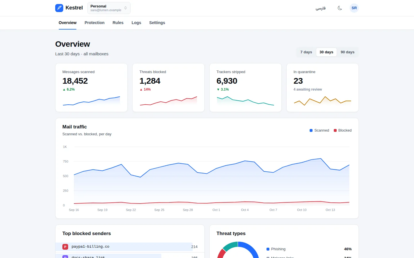
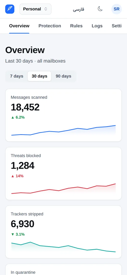
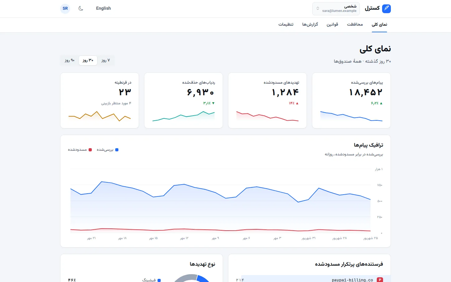
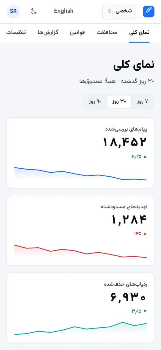
White cards on a cool gray canvas, one saturated brand color for action and state, and native system type. Marketing pages lead with a huge plain-language promise; the product is a top bar plus a tab strip over a centered column of setting cards that save instantly.

Best for
- Privacy, security and filtering tools
- Settings-heavy SaaS and admin consoles
- Notification and preference centers
- Developer utilities with a public landing page
Not ideal for
- Brands that need emotional, image-led storytelling
- Dense trading or analytics desks
- Playful consumer apps
Signature moves
- Headline in black with one or two phrases in the brand color
- Small uppercase brand-colored eyebrow above every section
- Setting rows: title, one-line plain description, switch at the end
- Instant save with a quiet toast — no Save buttons for toggles
- Top bar plus horizontal tab strip; no sidebar
- Live log rows marked by a colored start edge
Try it with another brand color
Opens the demo with only --brand changed. The style should still read as Switchboard.
Install this skill
/plugin marketplace add tastefolio/tastefolio.github.io
/plugin install switchboard@tastefolio
npx skills add tastefolio/tastefolio.github.io --skill switchboardcurl -L https://tastefolio.github.io/downloads/switchboard.zip -o switchboard.zip
unzip switchboard.zip -d .claude/skills/Copy the folder anywhere your agent can read it, then reference it from AGENTS.md / rules:
"Follow skills/switchboard/SKILL.md for every UI change."Files
Rate this style
Like it? Give it a 👍 below; you sign in with GitHub. The gallery’s Top rated order counts these votes and refreshes every hour. Comments and questions are welcome too.